Royal VKB
Food for Thought
Brand DesignWith a rich legacy dating back to 1789, Koninklijke Van Kempen & Begeer has left an indelible mark in the realm of durable stainless steel products and silverware for cooking and dining. Royal VKB, the latest addition to this esteemed Dutch company, represents a bold leap into innovation.
In an era where food preparation and wholesome dining hold newfound significance, Royal VKB has consistently focused on developing solutions for modern lifestyles. Their commitment to enhancing the culinary experience is evident in every meticulously crafted product.
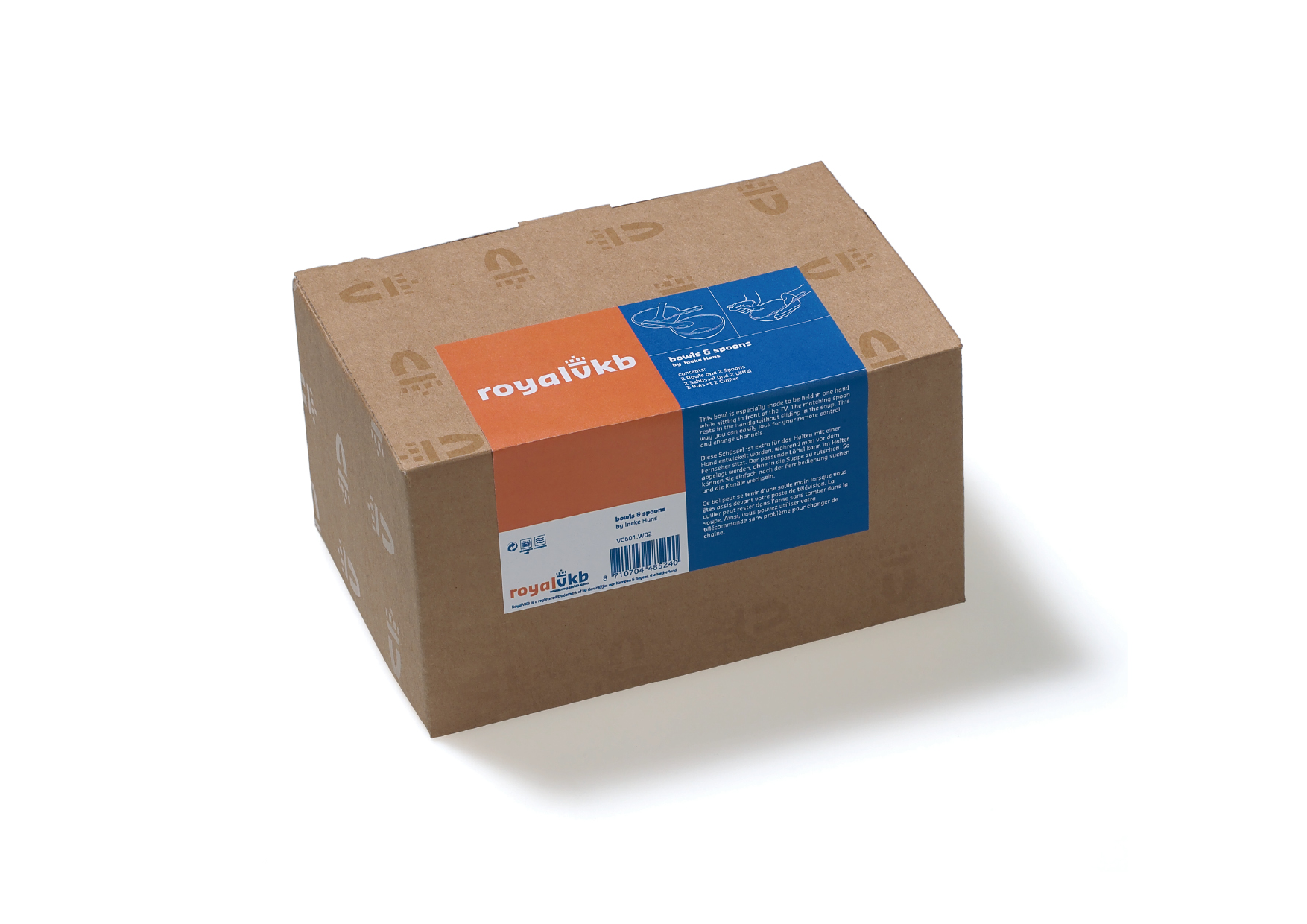
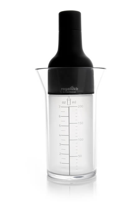
The brand's dual nature is artfully reflected in its international identity, with a striking interplay of two colors: dutch orange symbolizing warmth and emotion, and royal blue representing cool rationality. This dynamic visual language extends to product design, where technical specifications are housed in the blue segment, while the product's sensory appeal and usability are showcased in vibrant orange.
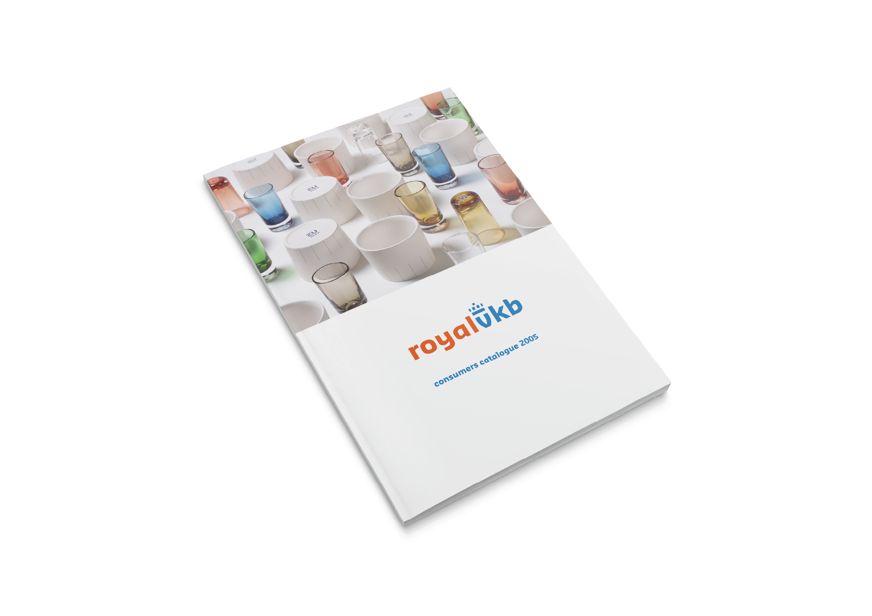
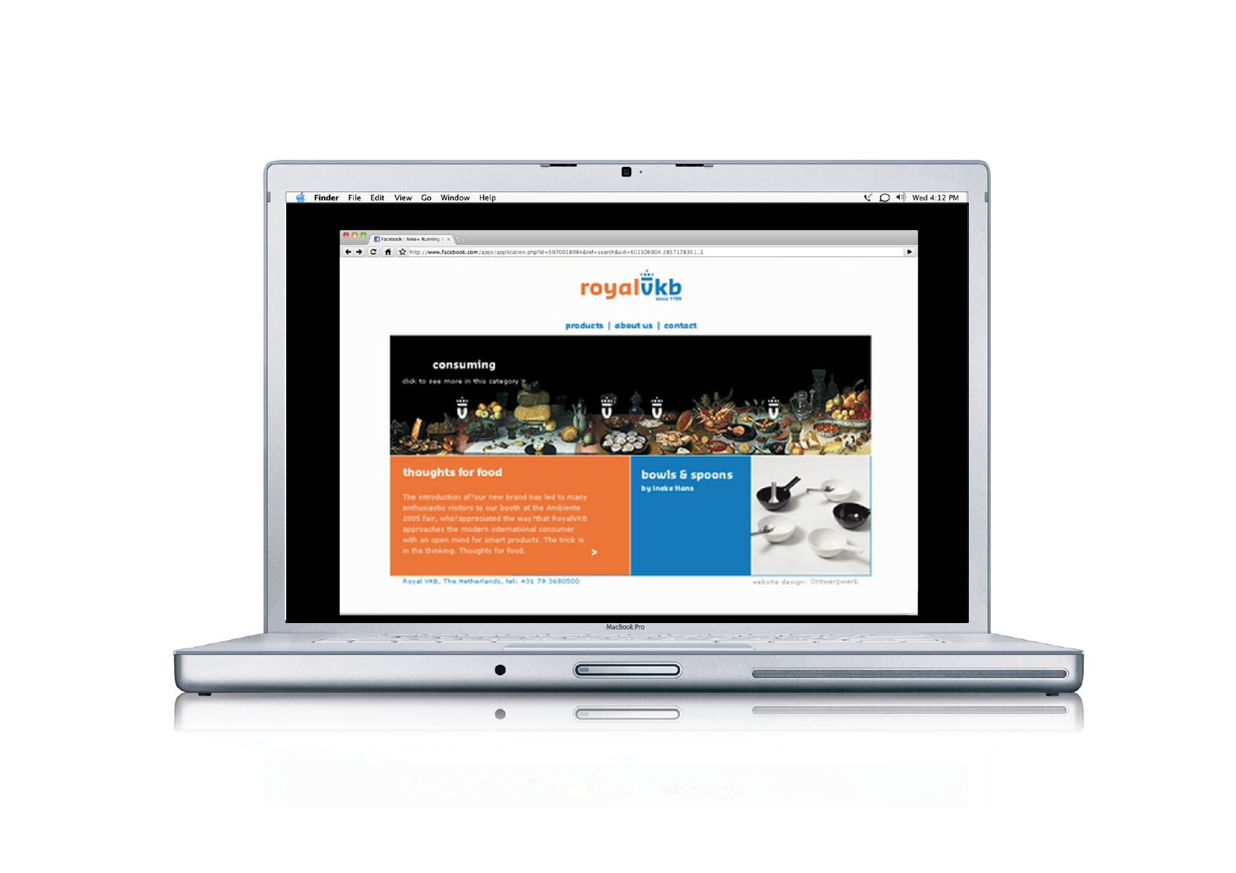
Consistency is key in Royal VKB's visual identity, with uniformity across all media. Whether it's packaging labels, advertisements, or brochures, every element adheres to a standardized format, ensuring clarity and coherence in communication.
www.royalvkb.com
Made at Ontwerpwerk


Visit us:
De Krachtcentrale
Havenstraat 76
1271 AG Huizen
The Netherlands
De Krachtcentrale
Havenstraat 76
1271 AG Huizen
The Netherlands
Member of
Association of Dutch Designers
![]()
Association of Dutch Designers